


Apr 27, 2016
Predictive Technologies: Can Smart Tools Augment the Brain's Predictive Abilities?
Oct 18, 2014
New Technique Helps Diagnose Consciousness in Locked-in Patients
Via Medgadget

Brain networks in two behaviourally-similar vegetative patients (left and middle), but one of whom imagined playing tennis (middle panel), alongside a healthy adult (right panel). Credit: Srivas Chennu
People locked into a vegetative state due to disease or injury are a major mystery for medical science. Some may be fully unconscious, while others remain aware of what’s going on around them but can’t speak or move to show it. Now scientists at Cambridge have reported in journal PLOS Computational Biology on a new technique that can help identify locked-in people that can still hear and retain their consciousness.
Some details from the study abstract:
We devised a novel topographical metric, termed modular span, which showed that the alpha network modules in patients were also spatially circumscribed, lacking the structured long-distance interactions commonly observed in the healthy controls. Importantly however, these differences between graph-theoretic metrics were partially reversed in delta and theta band networks, which were also significantly more similar to each other in patients than controls. Going further, we found that metrics of alpha network efficiency also correlated with the degree of behavioural awareness. Intriguingly, some patients in behaviourally unresponsive vegetative states who demonstrated evidence of covert awareness with functional neuroimaging stood out from this trend: they had alpha networks that were remarkably well preserved and similar to those observed in the controls. Taken together, our findings inform current understanding of disorders of consciousness by highlighting the distinctive brain networks that characterise them. In the significant minority of vegetative patients who follow commands in neuroimaging tests, they point to putative network mechanisms that could support cognitive function and consciousness despite profound behavioural impairment.
Study in PLOS Computational Biology: Spectral Signatures of Reorganised Brain Networks in Disorders of Consciousness
Aug 31, 2014
Information Entropy
Information – Entropy by Oliver Reichenstein
Will information technology affect our minds the same way the environment was affected by our analogue technology? Designers hold a key position in dealing with ever increasing data pollution. We are mostly focussed on speeding things up, on making sharing easier, faster, more accessible. But speed, usability, accessibility are not the main issue anymore. The main issues are not technological, they are structural, processual. What we lack is clarity, correctness, depth, time. Are there counter-techniques we can employ to turn data into information, information into knowledge, knowledge into wisdom?
Oliver Reichenstein — Information Entropy (SmashingConf NYC 2014) from Smashing Magazine on Vimeo.
Jul 13, 2014
An atomic view of brain activity
11:47 Posted in Information visualization, Research tools | Permalink | Comments (0)
Apr 06, 2014
Glass brain flythrough: beyond neurofeedback
Via Neurogadget
Researchers have developed a new way to explore the human brain in virtual reality. The system, called Glass Brain, which is developed by Philip Rosedale, creator of the famous game Second Life, and Adam Gazzaley, a neuroscientist at the University of California San Francisco, combines brain scanning, brain recording and virtual reality to allow a user to journey through a person’s brain in real-time.
Read the full story on Neurogadget
23:52 Posted in Biofeedback & neurofeedback, Blue sky, Information visualization, Physiological Computing, Virtual worlds | Permalink | Comments (0)
Feb 16, 2014
How much science is there?
The accelerating pace of scientific publishing and the rise of open access, as depicted by xkcd.com cartoonist Randall Munroe.
14:31 Posted in Blue sky, Information visualization | Permalink | Comments (0)
Oct 31, 2013
Brain Decoding
Via IEET
Neuroscientists are starting to decipher what a person is seeing, remembering and even dreaming just by looking at their brain activity. They call it brain decoding.
In this Nature Video, we see three different uses of brain decoding, including a virtual reality experiment that could use brain activity to figure out whether someone has been to the scene of a crime.
23:57 Posted in Information visualization, Neurotechnology & neuroinformatics, Research tools, Virtual worlds | Permalink | Comments (0)
Aug 04, 2012
Visualising the Emotional Response to LONDON 2012
Reblogged from InfoAesthetics

The Emoto visualization by the illustrious Moritz Stefaner, FutureEverything, and Studio NAND tracks twitter for themes related to the Games, analyzes the messages for content and emotional expressions, and visualizes topics and tone of the conversation. You can find out which topics are most discussed, or see all current messages related to the Games.
Emoto uses an origami looking glyph to represent the emotive summarization for each topic. The glyphs reshape and rearrange themselves based on realtime status. You can also view an overview of each day.
After the games, a set of data sculptures will be made to capture the collective emotion of the 2012 Olympics.
Kim Rees is a partner at Periscopic, a socially-responsible data visualization firm.
19:46 Posted in Information visualization | Permalink | Comments (0)
Mar 31, 2012
How Stephen Wolfram Spent the Last 22 Years (behind the Computer)
Via Infoesthetics
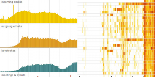
Stephen Wolfram, the chief designer of Mathematica and the Wolfram Alpha computational knowledge engine, has been setting a new norm in the fields of lifelogging, the quantified self and personal analytics, by accumulating several Nicholas Felton-amounts of data during his personal life.
Stephen has recently posted several graphs, dotplots and timelines, in an attempt to make some sense out of his 1 million outgoing email messages since 1989 (containing about 33,000 distinct words), 100 million keystrokes since 2002, every calendar event and scheduled meeting since 2000, all phone calls since 2004, and all his physical activity since 2004. To top all that off, Stephen has also several backups of his computer filesystems going back to 1980, and managed to somehow digitize about 230,000 paper documents, resulting in an immense mountain of potentially useful and revealing information about his historical work habits.
Not surprisingly, the overall patterns are quite straightforward: meetings and collaborative work during the day, a dinner-time break, more meetings and collaborative work, and then in the later evening more individual work. Most larger scale trends and patterns relate to according shifts in attention towards new projects.
13:12 Posted in Information visualization, Self-Tracking | Permalink | Comments (0)
Dec 02, 2009
Ring°Wall: World Largest Multi-Touch and Multi-User Wall
Via Infoaesthetic

The World's Biggest / Largest / Longest Multi-Touch (and evidently Multi-User) Wall is installed in Nürburgring (Germany) consists of a huge LED media facade (at the top), and a multitouch information-wall (at the bottom), and impresses by its physical size, as it totals a surface of about 425 square meters, equaling more than 6000 computer displays.
The interactive interface emerges out of 34 million pixels generated by 15 high definition projectors, supported by sound produced by 30 directional speakers. The multitouch capturing itself is based on laser technology, also called Laser Light Plane Illumination (LLP).
This means more than 80 users can simultaneously get informed about news and activities around the ringworld. Now imagine the sorts of sparklines this device could display...
You can watch a documentary movie below.
21:19 Posted in Information visualization | Permalink | Comments (0) | Tags: infoviz
Apr 29, 2009
Emotional Cartography
Via Info Aesthetic

The free-downloadable book Emotional Cartography - Technologies of the Self is a collection of essays that explores the political, social and cultural implications of visualizing intimate biometric data and emotional experiences using technology. The theme of this collection of essays is to investigate the apparent desire for technologies to map emotion, using a variety of different approaches.
18:11 Posted in Emotional computing, Information visualization | Permalink | Comments (0) | Tags: information visualization, affective computing
Apr 20, 2009
The Allosphere: an immersive virtual reality system to visualize scientific data
The need for computing tools that allows to visualize, explore and manipulate huge multidimensional data is becoming a key priority in several fields of science and engineering
From this perspective, an interesting possibility is the use of Immersive Virtual Reality. For example, researchers at the California NanoSystem Institute lead by Professor JoAnn Kuchera-Morin have created the AlloSphere, an interactive chamber made of two 5-meter-radius hemispheres of perforated aluminum that are designed to be optically opaque and acoustically transparent.
There are currently two projectors, mounted around the seam between the two hemispheres, approaching eye-limited resolution on the inner surface. The loudspeaker real-time sound synthesis cluster (around 500 individual speaker elements plus sub-woofers) is suspended behind the aluminum screen resulting in 3-D audio. Other clusters include simulation, sensor-array processing, effector-array processing, real-time video processing for motion-capture and visual computing, render-farm/real-time ray-tracing and radiosity cluster, and content and prototyping environments.
You can tour the Allosphere in this stunning video:
Here is an exterior photo of the AlloSphere @ the California Nanosystem Institute

13:35 Posted in Information visualization, Research tools | Permalink | Comments (0) | Tags: information visualization, science2.0
Apr 16, 2009
Turing Tables to understand earthquakes
Earthquakes are complex natural phenomena that are difficult to predict but also to understand.
German artist Franz John created an online installation - Turing Tables - that makes earthquakes easier to fathom while reminding us how alive the Earth is.
Inspired to the work of matematician Alan Turing, The Turing Tables gathers data from a multitude of small earthquake sensors (called “fingers”) stationed around the globe into a real-time, online installation before converting the data into image and sound. Green-and-black moving wallpaper—composed of numeric data and the locations and times at which the readings are taken—fills the room, along with a grating yet melodic soundtrack courtesy of Oakland-based sound artist Ed Osborn.

13:05 Posted in Cyberart, Information visualization | Permalink | Comments (0) | Tags: cyberart, information visualization
Apr 10, 2009
Closr.
Closr is a free service developed by the infoviz company VisUp that allows sharing and zooming high-resolution images (JPG, PNG e GIF format supported) in an easy, simple and fast way. The widgets have several useful functions, including a full-screen button, drag&drop photo navigation, and the possibility of resetting the picture to the starting size.
Thanks to these features, it is possible to embed the images in a blog post or in social networks. More, widgets can be tracked and organized using tags.
It took me 30 secs to upload and share this picture:
The creators of the service are Daniele Galiffa and Gabriele Venier. Nice job guys!
14:14 Posted in Information visualization | Permalink | Comments (0) | Tags: information visualization
Apr 03, 2009
Own Your Choices
Re-blogged from Info Aesthetics

Own Your Choices aims to reveal how personal choices affect others and characterize one's self. In particular, the website focuses on starting the conversation around topics such as tobacco, health, self-image, culture, alcohol, relationships and school. Users are invited to connect with peers on these issues, to share their opinion and influence the conversation. And by accident, the interface seems driven by simple dynamic graphs of the statists resulting from the data-gathering surveys.
Individual people are represented by small outer sectors on a circle, which are linked to individual profile pages. One can use filters on the right side of the screen, for instance to filter by gender, age or location, or to find like-minded peers, or complete opposites. More colors means more activity.
17:08 Posted in Information visualization | Permalink | Comments (0) | Tags: information visualization
Jan 26, 2009
WideNoise
One of the thing I hate most about living in a big city is the noise from road traffic. The most disturbing types of noise for me are (in order of irritation):
1) motorbike noise
2) emergency noise
3) noise from construction/demolition activites

In addition of being very unpleasant and harmful for our hearing system, noise can have negative impact on general health. For example, Swedish researchers have found that the exposure to even relatively low levels of noise may increase increase the risk of cardiovascular disease, heart attack and high blood pressure.
Even though we are accustomed to this background noise, we should at least be aware of how dangerous it is. Guys at WideTag have developed an iPhone/iPod touch application - WideNoise - that allows to monitor the noise level in the space surrounding the user. The noise data are collected and displayed on an online map. I think that this application could be also used by employers to monitor workplace noise.
Good job guys!


11:36 Posted in Information visualization, Locative media, Wearable & mobile | Permalink | Comments (0) | Tags: widenoise
Nov 22, 2008
Electronically enhanced sewing machine
Via Info Aesthetics

An electronically enhanced sewing machine [soundsbutter.com], able to represent sound through the height of the stitches it creates. The resulting stitch pattern thus becomes visually similar to an equalizer timeline. Unfortunately, currently a non-working prototype only.
16:10 Posted in Information visualization | Permalink | Comments (0) | Tags: infoviz
Nov 04, 2008
Textual emotion recognition and visualization

a textual emotion recognition & visualization engine based on the concept of synesthesia , or in other words: "code that feels the words visually". the synesketch application is able to dynamically transfer the text into animated visual patterns.
the emotional parameters are based on a WordNet-based lexicon of words with their general & specific emotional weights, for the emotion types happiness, sadness, fear, anger, disgust, surprise. the visualization is based on a generative painting system of imaginary colliding particles. colors & shapes of these patterns depend on the type and intensity of interpreted textual emotions.
22:02 Posted in Emotional computing, Information visualization | Permalink | Comments (0) | Tags: information visualization
Europe’s economic weather forecast

Cool infoviz services, in times of global financial crisis
Check it out:

12:18 Posted in Information visualization | Permalink | Comments (0)
Jul 23, 2008
Web GIS in practice VI: a demo "playlist" of geo-mashups for public health neogeographers
Web GIS in practice VI: a demo "playlist" of geo-mashups for public health neogeographers.
Int J Health Geogr. 2008 Jul 18;7(1):38
Authors: Kamel Boulos MN, Scotch M, Cheung KH, Burden D
ABSTRACT: 'Mashup' was originally used to describe the mixing together of musical tracks to create a new piece of music. The term now refers to Web sites or services that weave data from different sources into a new data source or service. Using a musical metaphor that builds on the origin of the word 'mashup', this paper presents a demonstration "playlist" of four geo-mashup vignettes that make use of a range of Web 2.0, Semantic Web, and 3-D Internet methods, with outputs/end-user interfaces spanning the flat Web (two-dimensional -- 2-D maps), a three-dimensional -- 3-D mirror world (Google Earth) and a 3-D virtual world (Second Life (R)). The four geo-mashup "songs" in this "playlist" are: 'Web 2.0 and GIS (Geographic Information Systems) for infectious disease surveillance', 'Web 2.0 and GIS for molecular epidemiology', 'Semantic Web for GIS mashup', and 'From Yahoo! Pipes to 3-D, avatar-inhabited geo-mashups'. It is hoped that this showcase of examples and ideas, and the pointers we are providing to the many online tools that are freely available today for creating, sharing and reusing geo-mashups with minimal or no coding, will ultimately spark the imagination of many public health practitioners and stimulate them to start exploring the use of these methods and tools in their day-to-day practice. The paper also discusses how today's Web is rapidly evolving into a much more intensely immersive, mixed-reality and ubiquitous socio-experiential Metaverse that is heavily interconnected through various kinds of user-created mashups.
08:46 Posted in Information visualization, Locative media, Social Media | Permalink | Comments (0) | Tags: locative media