


Jul 22, 2008
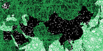
Web Trend Map 2008
Have a look at the Web Trend Map 2008, by Information Architects
The map is based on the Tokyo underground

Larger formats are available:
- Clickable Startpage with daily updated iA surf tips
- Big, A3 PDF (8MB, printable)
- 1600 x 1024 Wallpaper
- 1440 x 900 Wallpaper
14:10 Posted in Information visualization | Permalink | Comments (0) | Tags: information visualization
May 08, 2008
The shape of music
Via KurzweilAI.net
Three music professors have developed a method called "geometrical music theory" that translates the language of musical theory into that of contemporary geometry. (Dmitri Tymoczko, Princeton University) They categorize sequences of notes, like chords, rhythms and scales into "families" that can be represented by points in complex geometrical spaces.

18:18 Posted in Information visualization | Permalink | Comments (0) | Tags: information visualization
Mar 26, 2008
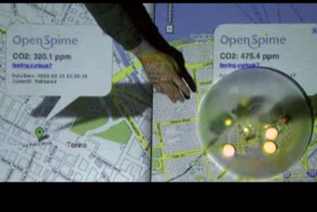
Towards Partecipative Ecology: the OpenSpime project
OpenSpime is a project of a pervasive technology infrastructure that allows individuals and corporations to better understand their environment, through the use of a series of GPS-enabled sensors.
A brainchild of Leandro Agrò, Roberto Ostinelli and David Orban, OpenSpime was inspired by Bruce Sterling's vision of "Internet of Things". Sterling describes a new type of technological device called "spime", a physical object that is part of the internet as it becomes trackable in space and time, through pervasive RFID communications and GPS navigation.
In this sense, OpenSpime platform represents one of the first concrete attempt to turn Internet of Things into reality.The first spime they've designed is a sensor that can measure the CO2 level in parts-per-million in the surrounding air, and through a wireless connection can send that information back to the OpenSpime servers. There they can be mashed up and aggregated on Google Maps.
check it out the concept video:
15:45 Posted in Information visualization | Permalink | Comments (0)
Mar 14, 2008
Viewing Google Sky through a browser
Google unveiled a browser version of its Google Sky application
The browser version of Google Earth software allows you to zoom in and out and pan around the celestial bodies, search for planets and galaxies and view the sky through infrared, x-ray, ultraviolet, and microwave views.

13:19 Posted in Information visualization | Permalink | Comments (0) | Tags: information visualization
Oct 20, 2007
My Map: Email visualization

My Map is a data visualization application capable of rendering the relationships between the user & individuals in the address book by examining the TO:, FROM:, and CC: fields of every email in the 60,000-large email archive.
the intensity of the relationship is determined by the color intensity of the line. "My Map" allows to explore different relational groupings & periods of time, revealing the temporal ebbs & flows in various relationships. My Map thus becomes a veritable self-portrait, a visual reflection of personal associations.
link: christopherbaker.net
17:20 Posted in Information visualization | Permalink | Comments (0) | Tags: information visualization
Oct 13, 2007
Death by PowerPoint
Via Leeander.com
Want to make a successful powerpoint presentation? Keep these few simple rules in mind (credits to Alexei Kapterev)
15:35 Posted in Information visualization | Permalink | Comments (0) | Tags: information visualization
Oct 01, 2007
2007 NSF Scientific Visualization Awards Announced

(Computer tomography scanner imagery of the sinuses of a patient)
The National Science Foundation (NSF) along with the journal Science, published by the American Association for the Advancement of Science (AAAS), today announced the winners of their fifth annual International Science and Technology Visualization Challenge.
Illustrators, photographers, computer programmers, and graphics specialists from around the world were invited to submit visualizations that would intrigue, explain and educate. More than 200 entries were received from 23 countries, representing every continent except the Arctic and Antarctica.
"Breakthroughs in science and engineering are often portrayed in movies and literature as 'ah-ha!' moments. What these artists and communicators have given us are similar experiences, showing us how bats fly or how nicotine becomes physically addictive," said Jeff Nesbit, director of NSF's Office of Legislative and Public Affairs. "We look at their visualizations, and we understand."
Winning entries can be viewed on the NSF Web site, the Science website (www.sciencemag.org ), and in the print issue of Science. First place and honorable mention winners are listed below. A number of semifinalist awards were made as well. Note: only two researchers are listed in this release; in some instances several others contributed to the winning visualization. No first place or honorable mention awards were made this year in the Illustrations category.
22:35 Posted in Information visualization | Permalink | Comments (0) | Tags: information visualization
Sep 05, 2007
Affective diary
Via InfoAesthetics


from the project website:
The affective diary assembles sensor data, captured from the user and uploaded via their mobile phone, to form an ambiguous, abstract colourful body shape. With a range of other materials from the mobile phone, such as text and MMS messages, photographs, etc., these shapes are made available to the user. Combining these materials, the diary is designed to invite reflection and to allow the user to piece together their own stories.
18:33 Posted in Emotional computing, Information visualization | Permalink | Comments (0) | Tags: information visualization, emotional computing
Aug 03, 2007
Anymails: Visualization of Email Inbox

“My thesis research investigates how one can use metaphors of natural form and behavior for information to support a better understanding of data systems. In everyday life we receive information mediated by behavior patterns and forms of appearance. For instance, if someone is crying, we can infer that the person is sad or may be happy. We can interpret this kind of information and set it in context to the situation because of our previous experiences. This is part of our human perception and supports a better understanding of situations and information. Users are confronted by constantly growing and changing amounts of data. There is a need for new visualizations that support understanding of information and its dynamic nature. I use natural metaphors to represent information. This includes the structure, navigation, interactivity, visualization and presentation of content. Visual and behavioral metaphors breathe life into information, creating rich, memorable experiences for users.”
Anymails: Visualization of my Email Inbox [Design & Concept: Carolin Horn; Code: Florian Jenett; Institute & Advisor: DMI Boston, Prof. Brian Lucid] - was developed during my MFA thesis Natural Metaphor For Information Visuzalizationthesis.zip, PDF, 7mb) at the Dynamic Media Institute Boston in 2007. The emails used in the prototype are read from the users local Apple Mail database. The prototype was built with Flash and Processing. The Anymails source code (OS-X 10.4.9 ppc) is available for download (2.5mb). (
13:57 Posted in Information visualization | Permalink | Comments (0) | Tags: information visualization
Jul 03, 2007
Collaborative data visualization

a user study of a new website that supports asynchronous collaboration across a variety of visualization types. its collaborative features includes view sharing, discussion, graphical annotation & social navigation. results of the study show emergent patterns of social data analysis, including cycles of observation & hypothesis, & the complementary roles of social navigation & data-driven exploration. the study ran in 2 different parts: a pair of controlled lab studies & a 3-week live deployment on the IBM corporate intranet.
Abstract. This paper describes mechanisms for asynchronous collaboration in the context of information visualization, recasting visualizations as not just analytic tools, but social spaces. We contribute the design and implementation of sense.us, a web site supporting asynchronous collaboration across a variety of visualization types. The site supports view sharing, discussion, graphical annotation, and social navigation and includes novel interaction elements. We report the results of user studies of the system, observing emergent patterns of social data analysis, including cycles of observation and hypothesis, and the complementary roles of social navigation and data-driven exploration.
Voyagers and Voyeurs: Supporting Asynchronous Collaborative Information VisualizationACM Human Factors in Computing Systems (CHI), 2007
22:20 Posted in Information visualization | Permalink | Comments (0) | Tags: computer-supported collaborative work
May 25, 2007
Electronic Lens
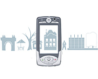
The Electronic Lens explores and creates new paradigms of civic ubiquitous networking with mobile technologies. We think of Electronic Lens as something of a viewfinder. Using a motion that is already familiar (think point and shoot camera phones), the citizen can use the eLens to gather information about physical objects and places.
The eLens matches electronic information with the physical environment in an innovative way. For example, eLens users can post lasting messages in physical locations, tag buildings and places, or create social networks based on interest and social affinities. eLens interactions combine the physical environment with formal and institutional information and the annotations from users' personal experiences.
Ultimately the eLens enhances the value of the city for its citizens by making their environments more accessible, more culturally vibrant, more socially just. The eLens fosters communication among people and between institutions; as a result citizens are now better able to navigate the social, institutional and physical urban space.
13:44 Posted in Information visualization, Locative media | Permalink | Comments (0) | Tags: locative media
Apr 27, 2007
Information Visualization - Cambridge, UK
Via UsabilityNews
Event Date: 14 May 2007 to 14 May 2007
Cambridge Usability Group: The speaker at our next event will be Bob Spence, author of the textbook "Information Visualization: Design for Interaction" and Emeritus Professor of Information Engineering at Imperial College London.
Date: Monday 14th May
Time: 6.30 for 6.45
Venue: Microsoft Research, Cambridge
Cost: The event is FREE and you do not need to be a UK UPA member to attend
Registration: Please email cambridge.usability@gmail.com to reserve a place.
12:44 Posted in Information visualization | Permalink | Comments (0) | Tags: information visualization
Apr 01, 2007
webpage wind maker
I could not resist to re-blog this stuff - so cooool!

from infoaesthetics
an ambient weather widget that applies the current wind conditions to any user-chosen website. it uses a United States ZIP Code to grab local conditions from the Yahoo Weather RSS feed, & animates individual pieces of the website, such as text blocks & images, according to the strength of the wind.
see also informative google themes & unseen weather video & voloce weather visualization & weather datacloud.
20:31 Posted in Information visualization | Permalink | Comments (0) | Tags: information visualization
Democratic polling interface
Re-blogged from InfoAesthetics

a web-based application prototype that allows participants to provide direct responses to current issues facing their governments on a selection of social scales (e.g. housing, health, immigration, social rights). the "Waterfall" interfaces visualizes the issues, votes & opinions of participants, with size depending on importance. "Where in the World" aligns contributing authors with their geographical location. "In Context" displays issues in a quantative by a matrix of horizontal stacked bar graphs.
links:
20:19 Posted in Information visualization, Social Media | Permalink | Comments (0) | Tags: social computing, social networks
Jan 25, 2007
Prospero - A "Visual Commons" Framework for Community-Aware Public Displays
Re-blogged from Networked Performance
Information about the community as a commons and about commons in the community can be useful for promoting a sense of shared fate and shared identity. In addition, as mobility increases, information about how a community moves into, out of, and through its spaces (such as public commons) can be a useful source of community feedback. A new project at the University of Michigan investigates using public displays to understand and represent community dynamics and preferences:
Prospero is an infrastructure to enable public displays to reflect evolving public participation. The objectives of the Prospero project arise from two primary motivations: one descriptive, the other normative. First, technologies that foster cooperation enhance our relationship to our surroundings. Many of these technologies incorporate user feedback in real-time.
Second, our team members believe that a society in which collective decision-making is based on participatory democracy and public resources should be allocated not by top-down or centrally-controlled mechanisms, but on the basis of the expressed desires and needs of participants. As cooperation increases, we have seen a resurgence of "the commons," i.e. that public sphere in which community values are expressed.
In our project, we shall explore this theme through its instantiation in the specific domain area of public displays. In much of modern life, public spaces, public media and public art are designed to send us messages that we passively receive, process and absorb. However, we believe that in a democracy, citizens must actively shape the public sphere. This necessitates "talking back" to the elements that constitute the public sphere. Public displays, that is, displays located in public spaces and accessible to a public, constitute an increasingly important element of the public sphere. We will develop an infrastructure for community-aware public displays that are controlled by users' expressed needs and preferences; we see our endeavor as part of an ongoing, democratic reclaiming, by citizens, of control over an increasing number of aspects of the public sphere in general.
Thus, by making a public display that is attentive to its community of users, a Visual Commons, it becomes possible for the community to escape the present hegemony of one-way communication, or "broadcast," of generic information (such as the time, or stock prices) or the barrage of mass-media advertising (such as occurs in New York City's Times Square). In effect, dynamic processing of community feedback regarding the contents of the display enables it to become more than just a billboard.
22:00 Posted in Information visualization, Social Media | Permalink | Comments (0) | Tags: social computing
Jan 22, 2007
Information Aesthetics: subway-style trend maps of 2007
Re-blogged from Information Aesthetics

a collection of trends maps documenting 2007, based on the visual style of subway maps. one map illustrates the recent web trends, while another shows the more general social trends (pdf) in Western society, including the rise of social networks & the democratization of the web. (via Information Aesthetics)
00:18 Posted in Information visualization | Permalink | Comments (0) | Tags: information visualization
Jan 15, 2007
Information Aesthetics: News stories network graph
Re-blogged from Information Aesthetics

a network visualization & news browsing tool that aggregates the news from more than 1,100 journalistic sources online, as part of one of the major Italian Internet Service providers Libero. GraphNews analyzes the content of news articles, with the goal of highlighting the main subjects (i.e. people, products, localities, societies, institutions, etc.) & extracts the relations that occur between them, resulting in a graph visualization of these subjects & their relations.a user can click a node (ellipse box), to create a new graph with subject & relations tied to that specific node, or an arc (square box), to return all the news that speak about the 2 subjects joined from the arc. GraphNews also allows to change of detail level or time period (i.e. day, week, month) of the graph.
23:22 Posted in Information visualization | Permalink | Comments (0) | Tags: information visualization
a map of the 'black holes' of the World Wide Web
a map of the 'black holes' of the World Wide Web, created by the "Reporters without Borders" organization, illustrating the countries that do not provide free access to the Internet information (i.e. Belarus, Birma, China, Cuba, Egypt, Iran, North Korea, Saudi Arabia, Syria, Tunisia, Turkmenistan, Uzbekistan & Vietnam).
23:12 Posted in Information visualization | Permalink | Comments (0) | Tags: information visualization
Jan 07, 2007
Technology Review: IBM's InfoViz software predictions
Technology Review interviewed Kristof Kloeckner, the vice president of strategy and technology for IBM's software group, to find out how software can be used to help people and businesses cope with the increasing amount of information, and how software will evolve as that information grows more complex.
Read the full interview
23:24 Posted in Information visualization | Permalink | Comments (0) | Tags: information visualization
Dec 15, 2006
3D RSS feed reader
Via Infoaesthetic
univeRSS is a 3D RSS feed reader for VISTA that "introduces a full-screen 3D universe where galaxies represent the folders of your RSS feed directory, and the stars are represented by the spinning cubes that hold the feed information. Size and position of the feed cubes indicate how many unread items they contain" (quoted from the Microsoft website)
Currently UniveRSS uses the RSS Feed Store managed through Internet Explorer 7. Later versions will allow you to manage the Feed Store from within the UniveRSS application.
00:03 Posted in Information visualization | Permalink | Comments (0) | Tags: information visualization