


Apr 29, 2009
Emotional Cartography
Via Info Aesthetic

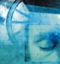
The free-downloadable book Emotional Cartography - Technologies of the Self is a collection of essays that explores the political, social and cultural implications of visualizing intimate biometric data and emotional experiences using technology. The theme of this collection of essays is to investigate the apparent desire for technologies to map emotion, using a variety of different approaches.
18:11 Posted in Emotional computing, Information visualization | Permalink | Comments (0) | Tags: information visualization, affective computing
Apr 20, 2009
The Allosphere: an immersive virtual reality system to visualize scientific data
The need for computing tools that allows to visualize, explore and manipulate huge multidimensional data is becoming a key priority in several fields of science and engineering
From this perspective, an interesting possibility is the use of Immersive Virtual Reality. For example, researchers at the California NanoSystem Institute lead by Professor JoAnn Kuchera-Morin have created the AlloSphere, an interactive chamber made of two 5-meter-radius hemispheres of perforated aluminum that are designed to be optically opaque and acoustically transparent.
There are currently two projectors, mounted around the seam between the two hemispheres, approaching eye-limited resolution on the inner surface. The loudspeaker real-time sound synthesis cluster (around 500 individual speaker elements plus sub-woofers) is suspended behind the aluminum screen resulting in 3-D audio. Other clusters include simulation, sensor-array processing, effector-array processing, real-time video processing for motion-capture and visual computing, render-farm/real-time ray-tracing and radiosity cluster, and content and prototyping environments.
You can tour the Allosphere in this stunning video:
Here is an exterior photo of the AlloSphere @ the California Nanosystem Institute

13:35 Posted in Information visualization, Research tools | Permalink | Comments (0) | Tags: information visualization, science2.0
Apr 16, 2009
Turing Tables to understand earthquakes
Earthquakes are complex natural phenomena that are difficult to predict but also to understand.
German artist Franz John created an online installation - Turing Tables - that makes earthquakes easier to fathom while reminding us how alive the Earth is.
Inspired to the work of matematician Alan Turing, The Turing Tables gathers data from a multitude of small earthquake sensors (called “fingers”) stationed around the globe into a real-time, online installation before converting the data into image and sound. Green-and-black moving wallpaper—composed of numeric data and the locations and times at which the readings are taken—fills the room, along with a grating yet melodic soundtrack courtesy of Oakland-based sound artist Ed Osborn.

13:05 Posted in Cyberart, Information visualization | Permalink | Comments (0) | Tags: cyberart, information visualization
Apr 10, 2009
Closr.
Closr is a free service developed by the infoviz company VisUp that allows sharing and zooming high-resolution images (JPG, PNG e GIF format supported) in an easy, simple and fast way. The widgets have several useful functions, including a full-screen button, drag&drop photo navigation, and the possibility of resetting the picture to the starting size.
Thanks to these features, it is possible to embed the images in a blog post or in social networks. More, widgets can be tracked and organized using tags.
It took me 30 secs to upload and share this picture:
The creators of the service are Daniele Galiffa and Gabriele Venier. Nice job guys!
14:14 Posted in Information visualization | Permalink | Comments (0) | Tags: information visualization
Apr 03, 2009
Own Your Choices
Re-blogged from Info Aesthetics

Own Your Choices aims to reveal how personal choices affect others and characterize one's self. In particular, the website focuses on starting the conversation around topics such as tobacco, health, self-image, culture, alcohol, relationships and school. Users are invited to connect with peers on these issues, to share their opinion and influence the conversation. And by accident, the interface seems driven by simple dynamic graphs of the statists resulting from the data-gathering surveys.
Individual people are represented by small outer sectors on a circle, which are linked to individual profile pages. One can use filters on the right side of the screen, for instance to filter by gender, age or location, or to find like-minded peers, or complete opposites. More colors means more activity.
17:08 Posted in Information visualization | Permalink | Comments (0) | Tags: information visualization
Nov 04, 2008
Textual emotion recognition and visualization

a textual emotion recognition & visualization engine based on the concept of synesthesia , or in other words: "code that feels the words visually". the synesketch application is able to dynamically transfer the text into animated visual patterns.
the emotional parameters are based on a WordNet-based lexicon of words with their general & specific emotional weights, for the emotion types happiness, sadness, fear, anger, disgust, surprise. the visualization is based on a generative painting system of imaginary colliding particles. colors & shapes of these patterns depend on the type and intensity of interpreted textual emotions.
22:02 Posted in Emotional computing, Information visualization | Permalink | Comments (0) | Tags: information visualization
Jul 22, 2008
Web Trend Map 2008
Have a look at the Web Trend Map 2008, by Information Architects
The map is based on the Tokyo underground

Larger formats are available:
- Clickable Startpage with daily updated iA surf tips
- Big, A3 PDF (8MB, printable)
- 1600 x 1024 Wallpaper
- 1440 x 900 Wallpaper
14:10 Posted in Information visualization | Permalink | Comments (0) | Tags: information visualization
May 08, 2008
The shape of music
Via KurzweilAI.net
Three music professors have developed a method called "geometrical music theory" that translates the language of musical theory into that of contemporary geometry. (Dmitri Tymoczko, Princeton University) They categorize sequences of notes, like chords, rhythms and scales into "families" that can be represented by points in complex geometrical spaces.

18:18 Posted in Information visualization | Permalink | Comments (0) | Tags: information visualization
Mar 14, 2008
Viewing Google Sky through a browser
Google unveiled a browser version of its Google Sky application
The browser version of Google Earth software allows you to zoom in and out and pan around the celestial bodies, search for planets and galaxies and view the sky through infrared, x-ray, ultraviolet, and microwave views.

13:19 Posted in Information visualization | Permalink | Comments (0) | Tags: information visualization
Oct 20, 2007
My Map: Email visualization

My Map is a data visualization application capable of rendering the relationships between the user & individuals in the address book by examining the TO:, FROM:, and CC: fields of every email in the 60,000-large email archive.
the intensity of the relationship is determined by the color intensity of the line. "My Map" allows to explore different relational groupings & periods of time, revealing the temporal ebbs & flows in various relationships. My Map thus becomes a veritable self-portrait, a visual reflection of personal associations.
link: christopherbaker.net
17:20 Posted in Information visualization | Permalink | Comments (0) | Tags: information visualization
Oct 13, 2007
Death by PowerPoint
Via Leeander.com
Want to make a successful powerpoint presentation? Keep these few simple rules in mind (credits to Alexei Kapterev)
15:35 Posted in Information visualization | Permalink | Comments (0) | Tags: information visualization
Oct 01, 2007
2007 NSF Scientific Visualization Awards Announced

(Computer tomography scanner imagery of the sinuses of a patient)
The National Science Foundation (NSF) along with the journal Science, published by the American Association for the Advancement of Science (AAAS), today announced the winners of their fifth annual International Science and Technology Visualization Challenge.
Illustrators, photographers, computer programmers, and graphics specialists from around the world were invited to submit visualizations that would intrigue, explain and educate. More than 200 entries were received from 23 countries, representing every continent except the Arctic and Antarctica.
"Breakthroughs in science and engineering are often portrayed in movies and literature as 'ah-ha!' moments. What these artists and communicators have given us are similar experiences, showing us how bats fly or how nicotine becomes physically addictive," said Jeff Nesbit, director of NSF's Office of Legislative and Public Affairs. "We look at their visualizations, and we understand."
Winning entries can be viewed on the NSF Web site, the Science website (www.sciencemag.org ), and in the print issue of Science. First place and honorable mention winners are listed below. A number of semifinalist awards were made as well. Note: only two researchers are listed in this release; in some instances several others contributed to the winning visualization. No first place or honorable mention awards were made this year in the Illustrations category.
22:35 Posted in Information visualization | Permalink | Comments (0) | Tags: information visualization
Sep 05, 2007
Affective diary
Via InfoAesthetics


from the project website:
The affective diary assembles sensor data, captured from the user and uploaded via their mobile phone, to form an ambiguous, abstract colourful body shape. With a range of other materials from the mobile phone, such as text and MMS messages, photographs, etc., these shapes are made available to the user. Combining these materials, the diary is designed to invite reflection and to allow the user to piece together their own stories.
18:33 Posted in Emotional computing, Information visualization | Permalink | Comments (0) | Tags: information visualization, emotional computing
Aug 03, 2007
Anymails: Visualization of Email Inbox

“My thesis research investigates how one can use metaphors of natural form and behavior for information to support a better understanding of data systems. In everyday life we receive information mediated by behavior patterns and forms of appearance. For instance, if someone is crying, we can infer that the person is sad or may be happy. We can interpret this kind of information and set it in context to the situation because of our previous experiences. This is part of our human perception and supports a better understanding of situations and information. Users are confronted by constantly growing and changing amounts of data. There is a need for new visualizations that support understanding of information and its dynamic nature. I use natural metaphors to represent information. This includes the structure, navigation, interactivity, visualization and presentation of content. Visual and behavioral metaphors breathe life into information, creating rich, memorable experiences for users.”
Anymails: Visualization of my Email Inbox [Design & Concept: Carolin Horn; Code: Florian Jenett; Institute & Advisor: DMI Boston, Prof. Brian Lucid] - was developed during my MFA thesis Natural Metaphor For Information Visuzalizationthesis.zip, PDF, 7mb) at the Dynamic Media Institute Boston in 2007. The emails used in the prototype are read from the users local Apple Mail database. The prototype was built with Flash and Processing. The Anymails source code (OS-X 10.4.9 ppc) is available for download (2.5mb). (
13:57 Posted in Information visualization | Permalink | Comments (0) | Tags: information visualization
Jul 26, 2007
Visual relaxation landscapes

This website shows beatiful animated landscape loops designed for visual relaxation (Flash plugin required)
19:11 Posted in Emotional computing | Permalink | Comments (0) | Tags: information visualization, emotional computing
Apr 27, 2007
Information Visualization - Cambridge, UK
Via UsabilityNews
Event Date: 14 May 2007 to 14 May 2007
Cambridge Usability Group: The speaker at our next event will be Bob Spence, author of the textbook "Information Visualization: Design for Interaction" and Emeritus Professor of Information Engineering at Imperial College London.
Date: Monday 14th May
Time: 6.30 for 6.45
Venue: Microsoft Research, Cambridge
Cost: The event is FREE and you do not need to be a UK UPA member to attend
Registration: Please email cambridge.usability@gmail.com to reserve a place.
12:44 Posted in Information visualization | Permalink | Comments (0) | Tags: information visualization
Apr 01, 2007
webpage wind maker
I could not resist to re-blog this stuff - so cooool!

from infoaesthetics
an ambient weather widget that applies the current wind conditions to any user-chosen website. it uses a United States ZIP Code to grab local conditions from the Yahoo Weather RSS feed, & animates individual pieces of the website, such as text blocks & images, according to the strength of the wind.
see also informative google themes & unseen weather video & voloce weather visualization & weather datacloud.
20:31 Posted in Information visualization | Permalink | Comments (0) | Tags: information visualization
Jan 22, 2007
Information Aesthetics: subway-style trend maps of 2007
Re-blogged from Information Aesthetics

a collection of trends maps documenting 2007, based on the visual style of subway maps. one map illustrates the recent web trends, while another shows the more general social trends (pdf) in Western society, including the rise of social networks & the democratization of the web. (via Information Aesthetics)
00:18 Posted in Information visualization | Permalink | Comments (0) | Tags: information visualization
Jan 15, 2007
Information Aesthetics: News stories network graph
Re-blogged from Information Aesthetics

a network visualization & news browsing tool that aggregates the news from more than 1,100 journalistic sources online, as part of one of the major Italian Internet Service providers Libero. GraphNews analyzes the content of news articles, with the goal of highlighting the main subjects (i.e. people, products, localities, societies, institutions, etc.) & extracts the relations that occur between them, resulting in a graph visualization of these subjects & their relations.a user can click a node (ellipse box), to create a new graph with subject & relations tied to that specific node, or an arc (square box), to return all the news that speak about the 2 subjects joined from the arc. GraphNews also allows to change of detail level or time period (i.e. day, week, month) of the graph.
23:22 Posted in Information visualization | Permalink | Comments (0) | Tags: information visualization
a map of the 'black holes' of the World Wide Web
a map of the 'black holes' of the World Wide Web, created by the "Reporters without Borders" organization, illustrating the countries that do not provide free access to the Internet information (i.e. Belarus, Birma, China, Cuba, Egypt, Iran, North Korea, Saudi Arabia, Syria, Tunisia, Turkmenistan, Uzbekistan & Vietnam).
23:12 Posted in Information visualization | Permalink | Comments (0) | Tags: information visualization